Thursday, October 11, 2007
Thursday, October 04, 2007
Review - Clockwork Creature: Chapter One
Review - Clockwork Creature: Chapter One
Written & Drawn by Kyle Strahm
Ambrosia Publishing, Fall 2007; $6.95

“By the pricking of my thumbs,
Something wicked this way comes.”
This infamous line, which is uttered by a witch during the opening of Act IV of Shakespeare’s tragic play Macbeth, could replace the tinderstick-like title text of Clockwork Creature: Chapter One. Better still, the rest of the artwork in the book lives up to this devilishly enchanting forecast - delivering a carnival of menacing shadows and bewitchingly garish patterns. In short: Pure visual delight from cover to cover.
Drawn exclusively in high-contrast black and white, Kyle Strahm’s pages are black pools of night etched with figures and structures ablaze in searing white moonlight. His ghostly farm-town and its inhabitants are strung with diaphanous shadows that conjure amazing subtleties of depth of field. The spectral details of their agrarian charms are strangely visually magnetic: The frayed edges of overalls and errant facial hairs cast harsh shadows in the unforgiving glare of sinister moonbeams.
The creature itself appears graceful and innocent in comparison, despite its mammoth proportions. The solid, quadrapedal beast is hidden beneath a patchwork quilt of checkers, stripes and polka dots, stitched together with big loops of ivory thread. The blanket edges and hollows billow and flap gracefully about the creature, rife with anthropomorphic suggestion. In odd contrast to the vintage environment and its own old-fashioned drapery, the creature has rounded, metal robot feet, with big coiled springs for Achille’s heels.

If only the actual story were not such a disappointment, CC would be a masterpiece. At best, CC promises to be a tepid adaptation of Frankenstein; at worst, a mystery with no intrigue. Not every mystery has to have a clever twist, but every story has got to have a resolution. And nothing compelling is accomplished in Chapter One.
The story is not without promise during its set up. A bizarre creature has appeared in town; men have disappeared. Fearful townies have gathered at a local watering hole to suss out a solution. Weakened by panic (and, one suspects, not being overly-endowed with a surplus of mental acuity in the first place) the men fall prey the verbal rallying of the nefarious Baron von Salt, who looks like an evil circus ringmaster. Sadly, the gist of the Baron’s diatribe is to kill the beast with what looks like a Tommy gun, which he ridiculously brandishes as a “weapon … FROM THE FUTURE!” The only thing the presence of the modern-day gun really destroys is the delightfully antediluvian atmosphere.
Meanwhile, some of the missing men have found some of the other disappeared fellows, who in turn have figured out that the creature is not a menace at all. Rather, they have determined that the beast was lonely, based on the fact that several of its supposed victims (chickens) are still alive, and that the mute beast itself has saved a man from the creek (which reminds me of a scene from Universal Studio’s 1931 version of “Frankenstein,” in which the famous monster makes friends with a little girl on the bank of a lake).
In a very movie-monster manner, the pitchfork-brandishing mob descends upon an old mill, where the creature waits unsuspecting with its new friends. There follows the most awkward shoot-out scene of all time, in which almost everyone gets killed by the Baron. Enraged by this slaughter, the creature brutally murders the Baron, thus frightening its remaining friends (who are oddly un-phased by the mass murder of their neighbors by a total stranger). They run off, leaving the creature alone, to bow its head and amble along alone once more. Ho-hum.
None of the characters were developed enough for the reader to care about what happens to them! The creature has not been developed enough for the reader to care that it is lonely (again). The Baron may have had an evil design upon an innocent creature, but we don’t know enough about it to rejoice in his downfall. Finally, the townfolk (with one exception) have that sort of collective personality that, in the end, simply amounts to unaffecting numbers, in the same way that newspaper reports of body counts are less moving than a single tale of tragedy.
The sole exception to this stale conclusion is a man by the name of Jebbins. He is the man who was saved from the creek by the creature. As Jebbins’ friend tells it, “I don’t reckon you could get Jebbins away from its side if you wanted to.” But the scene in which Jebbins is saved is not part of the story. He’s also the first to die in the massacre. Perhaps a future issue will flashback to this scene, which would go a long way toward developing some characters that would make this book worth reading in the long term.
Without a proper ending, a masterfully illustrated comic book is little more than a gilded goblet with a big hole in the bottom. It gets you geared up for a drink of something special, and all you are left with is a faint taste on your lips and a very wet lap. At least when you’re finished reading it, you won’t feel guilty about snipping out a few choices panels for some uniquely cryptic home decor.
Written & Drawn by Kyle Strahm
Ambrosia Publishing, Fall 2007; $6.95
“By the pricking of my thumbs,
Something wicked this way comes.”
This infamous line, which is uttered by a witch during the opening of Act IV of Shakespeare’s tragic play Macbeth, could replace the tinderstick-like title text of Clockwork Creature: Chapter One. Better still, the rest of the artwork in the book lives up to this devilishly enchanting forecast - delivering a carnival of menacing shadows and bewitchingly garish patterns. In short: Pure visual delight from cover to cover.
Drawn exclusively in high-contrast black and white, Kyle Strahm’s pages are black pools of night etched with figures and structures ablaze in searing white moonlight. His ghostly farm-town and its inhabitants are strung with diaphanous shadows that conjure amazing subtleties of depth of field. The spectral details of their agrarian charms are strangely visually magnetic: The frayed edges of overalls and errant facial hairs cast harsh shadows in the unforgiving glare of sinister moonbeams.
The creature itself appears graceful and innocent in comparison, despite its mammoth proportions. The solid, quadrapedal beast is hidden beneath a patchwork quilt of checkers, stripes and polka dots, stitched together with big loops of ivory thread. The blanket edges and hollows billow and flap gracefully about the creature, rife with anthropomorphic suggestion. In odd contrast to the vintage environment and its own old-fashioned drapery, the creature has rounded, metal robot feet, with big coiled springs for Achille’s heels.
If only the actual story were not such a disappointment, CC would be a masterpiece. At best, CC promises to be a tepid adaptation of Frankenstein; at worst, a mystery with no intrigue. Not every mystery has to have a clever twist, but every story has got to have a resolution. And nothing compelling is accomplished in Chapter One.
The story is not without promise during its set up. A bizarre creature has appeared in town; men have disappeared. Fearful townies have gathered at a local watering hole to suss out a solution. Weakened by panic (and, one suspects, not being overly-endowed with a surplus of mental acuity in the first place) the men fall prey the verbal rallying of the nefarious Baron von Salt, who looks like an evil circus ringmaster. Sadly, the gist of the Baron’s diatribe is to kill the beast with what looks like a Tommy gun, which he ridiculously brandishes as a “weapon … FROM THE FUTURE!” The only thing the presence of the modern-day gun really destroys is the delightfully antediluvian atmosphere.
Meanwhile, some of the missing men have found some of the other disappeared fellows, who in turn have figured out that the creature is not a menace at all. Rather, they have determined that the beast was lonely, based on the fact that several of its supposed victims (chickens) are still alive, and that the mute beast itself has saved a man from the creek (which reminds me of a scene from Universal Studio’s 1931 version of “Frankenstein,” in which the famous monster makes friends with a little girl on the bank of a lake).
In a very movie-monster manner, the pitchfork-brandishing mob descends upon an old mill, where the creature waits unsuspecting with its new friends. There follows the most awkward shoot-out scene of all time, in which almost everyone gets killed by the Baron. Enraged by this slaughter, the creature brutally murders the Baron, thus frightening its remaining friends (who are oddly un-phased by the mass murder of their neighbors by a total stranger). They run off, leaving the creature alone, to bow its head and amble along alone once more. Ho-hum.
None of the characters were developed enough for the reader to care about what happens to them! The creature has not been developed enough for the reader to care that it is lonely (again). The Baron may have had an evil design upon an innocent creature, but we don’t know enough about it to rejoice in his downfall. Finally, the townfolk (with one exception) have that sort of collective personality that, in the end, simply amounts to unaffecting numbers, in the same way that newspaper reports of body counts are less moving than a single tale of tragedy.
The sole exception to this stale conclusion is a man by the name of Jebbins. He is the man who was saved from the creek by the creature. As Jebbins’ friend tells it, “I don’t reckon you could get Jebbins away from its side if you wanted to.” But the scene in which Jebbins is saved is not part of the story. He’s also the first to die in the massacre. Perhaps a future issue will flashback to this scene, which would go a long way toward developing some characters that would make this book worth reading in the long term.
Without a proper ending, a masterfully illustrated comic book is little more than a gilded goblet with a big hole in the bottom. It gets you geared up for a drink of something special, and all you are left with is a faint taste on your lips and a very wet lap. At least when you’re finished reading it, you won’t feel guilty about snipping out a few choices panels for some uniquely cryptic home decor.
Thursday, September 27, 2007
Review - Buffy the Vampire Slayer Season 8 No. 5 (variant cover)
Review - Buffy the Vampire Slayer Season 8 No. 5 (variant cover)
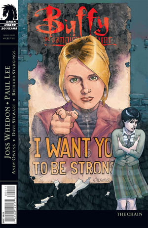
Writer: Joss Whedon
Cover Artist: Georges Jeanty
Penciller: Paul Lee
Inker: Andy Owens
Colorist: Dave Stewart
One-shot issues are the quickie of the comic book medium. And, like its sexual counterpart, the one shot can be incredible and mind-blowing, or - more often than not - an embarrassing experience best hastily forgotten by all those involved. Buffy the Vampire Slayer No. 5 bounces back and forth between these two poles.
The in-and-out nature of communicating a story in one issue is an unappreciated challenge: On the one hand, the writer has got to show his faithful fans a new angle of familiar material; while, on the other hand, the one-shot affords the writer an opportunity to step out of continuity and reach a new crowd. In this case, the new reader could be (gasp) someone so unfamiliar with the Buffyverse (Joyce forbid!) that they just bought the book because they dug the cover art.
For Buffy buffs, the success of No. 5 hangs, quite literally, by a nose. There is no denying that Sarah Michelle Gellar's most idiosyncratic facial feature is her long, thin nose, which has two very angular pieces of cartilage sitting atop each nostril. BTVS No. 5 presented Paul Lee with a daunting task: To draw a vampire slayer who has gone undercover posing as Buffy that looks enough like Buffy to fool other characters in the story, but also enough not like Buffy that fans know she's not the real Buffster. Lee achieved this by making imposter-Buffy's nose look different. Alas, I didn't catch that imposter-Buffy was not the genuine article until the story revealed the plot twist. I just thought Buffy's nose looked funny. This was a pretty crucial blow to enjoying the book the first time I read it.
And I don't administer that nose note as a criticism of Lee's art. The illustrations in the book are solid. Particularly memorable are the underground creatures, such as the faeries, slug clan ... and who can forget "that thing that looks like a leaf-blower"?
That said, the non-linear storytelling in this issue further confounded the reveal. Whedon seems to vacillate between wanting to spell everything out for new readers, and being flippant with rehashes to keep his fan base satisfied. For example, one sequence jumps quickly among three threads: Imposter Buff (henceforth IB) on her present undercover mission; IB passed out on her high school lawn after the physical trauma of realizing she is a slayer (which involves being hit with the collective memory of a bajillion slayerettes at once - very skillfully illustrated by Lee); and listening to Giles give a speech at the slayer academy. Running over all these panels is some throw-away monologue about what it means to be a slayer. To give him the benefit of the doubt, Whedon likely had too much to say and not enough space to say it, which resulted in some fast-forwarded, over-dramatic build-up with no, ahem, climax.
The few choice moments when Whedon does slows down to assemble the moment-to-moment narrative is when he really woos the reader. These scenes include such stellar quotes as, "I didn't lay my faerie eggs inside your inner ear canal to watch you die!" And let's not forget: "I left you one to wipe with." Perhaps my favorite sequence in the book is Whedon's depiction of a slayer field training session, in which IB and her slayer squad face off with a group of vamps in (where else?) a dark alley. IB's fighting skills aren't flawless and winning her hordes of adoring fans, but she does "take a bite" (from a vamp) while saving a fellow slayer. This poignant vignette captures a truism we all know yet too often forget: It is better to be loved by one person than popular with many. A million fans won through acts of showmanship are worth less than one loving friend acquired through an act of self sacrifice. And self sacrifice is more difficult. When IB disparages her neck wound as the result of her lack of prowess, her friend not only reminds her of this, but also dishes out the clever compliment: "Besides ... I hear Buffy's got a neck wound too." (Can you hear me smiling?!)
So, all in all, for Buffy fans, this one shot does what any good quickie should: keep you coming back for more. The name "Buffy" means something different to every fan, but what all BTVS fans have in common is the knowledge that, as IB so cleverly illustrates in BTVS No. 5, "millions of people go into making a name." BTVS No. 5 gives us a glimpse into the life of one of those millions; one who is ultimately OK with living and dying anonymously. In this era of fame-worship and celebutantes, that is a very stirring idea.
But what about non-BTVS regulars? They may still find the aforementioned heart of the book moving, but maybe not as much as a Buffy fan, to whom the name really means something. Although it may not appeal to every comic book fan, I think there are enough enticing story angles to compel certain persons of discerning and unusual taste - those who like their entertainment to have a heart and a lesson plan - to return for another round.
Monday, September 24, 2007
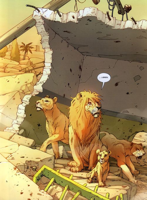
Law of the Jungle, or Lions Love Their Children, Too?
Based on true events in which a group of lions escape from a zoo during the opening days of the U.S. "shock and awe" bombing campaign against Iraq, Brian K. Vaughan's Pride of Baghdad dramatizes their short adventure through the ruins of the eponymous city. Driven by hunger and the need to avoid intermittent explosions, the four lions- a protective, savvy male; an eager cub; and two lionesses- one old and world-weary, the other in her prime, pining for freedom from the Zoo- explore, hunt, fight, and take time out to gaze at the sunset until finally they are machine-gunned to pieces by a dopey American soldier.
Niko Henrichon's art is drawn with a confident, sketchy style brought to life with painterly coloring- particularly nice is his use of light and shadow filtered through trees, as well the varying concentrations of algae in the water. Detailed cityscapes, strong use of perspective and careful attention to leonine anthropomorphic facial emoting makes the overall presentation very attractive.
Vaughan's characterization is adequate though at times perfunctory, with relationships just plausible enough to keep the story moving forward and its premise afloat. The writing is at its best when Vaughan takes the time to develop a unique animalian culture. Creating something foreign yet plausible is pretty hard to do with sort-of- sci-fi situations (think aliens with Chinese accents). I like to see how writers resolve this problem. In this case Vaughn creates feline-specific maxims: "Little brains belong in our mouths, not in our heads."
Still, the effect is at times undermined by the occasional colloquialism seemingly coopted from their human oppressors. "You don't look a gift horse in the mouth," says Zill (the male lion), "you eat him." I would guess this particular line was hard to resist, but the story suffers from this inconsistency. It may be a comment on the institutionalization of those imprisoned, but it's somewhat less interesting than being taken through something idiosyncratic and new, a possibility I see existing for the depiction of a familial unit of animals who in nature do little else but kill and sleep.
The basic idea behind the premise, which is to see the devastation of the Iraq war through the eyes of animals (i.e. 'innocents'), is the only really well supported theme in this story, but it feels tired and weather worn, especially considering the fact that it's been used in every animal drama from Bambi to Twilight of the Cockroaches. And there was the inevitable comparison to Disney, vis. the Lion King, initiated by the evident resemblance between the respective lion cub characters and perpetuated by the story's underlying sentimentality w/r/t the lions' love/meat relationship with humans, all of whom they naturally refer to as 'keepers.' While obviously more violent and gritty (giraffe explodes halfway up the neck), it's hard to keep akuna matata from niggling in your head, at least for the first few pages.
It's tough to pin down the story's central themes: Statements like "trust me, nothing that size has enemies" when referring to roving tanks seems weighty and ironic, but isn't supported by and therefor doesn't contribute to any other aspect of the story, and doesn't really even make sense. When the dopey American soldier scrambles to justify the shooting, his superior officer consoles him by saying the lions are now "free."
 Even the epiloguey final word, following a note informing the reader that all this really happened, is unsatisfyingly ambiguous: "There were other casualties as well." Considering the context it's hard not to conclude that Vaughan means to suggest the human cost is somehow less tragic than that of the lions. That humans are vile and deserving of the horrors they visit upon themselves is a fair attitude for a certain kind of writing to have, though considering the half-million and rising civilian death toll in Iraq, it's inappropriate here. And in any case, it contradicts one of the central conflicts, which is whether humans are friends or meat.
In general this story feels like a drama that can't decide whether to use the adventure/tragedy as an analogy for man's intrusion into nature and innocents specifically or as a self-aware critique on the vile human condition. By straddling the line between the two, not fully committing to either, Pride of Baghdad comes off as opportunistic and unfocused.
Best line: "I always wanted to kill a baby goat!"
Saturday, September 22, 2007
Sugarshock #2 is available @ DHP!
Get thee to the Dark Horse Presents myspace page! (Unless you haven't read the first issue, then click here.)

The Joss commandeth you! Oh, and a special little piece of news: It appears that the 3rd issue will be the final. Show your support of this delightful title, although I can't see Sugarshock! disappearing forever.
While you are over at DHP, also take a moment to look at the other complimentary issues including Tony Millionaire's Sock Monkey.
Sunday, September 09, 2007
Review - Buffy Season 8 #5
BUFFY THE VAMPIRE SLAYER: SEASON EIGHT #5
By Joss Whedon, Paul Lee & Andy Owens
Colors by Dave Stewart, Letters by Richard Starkings & Comicraft’s Jimmy
Published by Dark Horse Comics, August 2007. $2.99
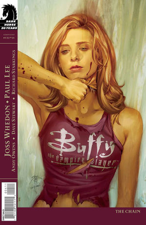
Joss Whedon has weaved his basic themes of redemption, equality, and female empowerment in all of his stories and here he is doing it again with confidence. A decoy Buffy, explored in this issue, received her powers with a shock of thunderous pain, along with the bonus prize of shared memories and the legacy of female strength. A hilarious television commercial is presented by Andrew, who I imagine is functioning in a public relations capacity, which calls back to his many awkward daydreams and graphs in season 7. Decoy Buffy is recruited through these means and her life is forever changed. She feels the tug of humanity, and discovers the resources to believe in her abilities. In one of her first missions with a group of young slayers she is savagely bitten while trying to save a fellow mate. The mate lets her know the wound is a badge of honor as she has heard Buffy has a neck wound too. One particularly moving sequence involves a recruiter offering her the mission as decoy Buffy saying, “….I gotta figure you want the truth. As in ‘Why me? Did I get the hardest, darkest path to walk ‘cause I’m strong, I’m good, I can handle the heavier burden? Or am I weak, expendable, the one that won’t be missed. The truth? There is no truth. There’s just what you believe.” That passage cuts to the heart of the whole series
Yes, I am the resident Joss Whedon fanatic, and it would be difficult for me to point out any serious flaws in anything he has done thus far. I feel fortunate that I can say “The Chain” is his best work since Angel season 5’s disturbing episode, “A Hole in the World.” With that, I must point out this is not the strongest issue to enter the series as a new reader. The structure is non-linear and there is only brief mention made of our new world of 2,000 slayers and the decoy Buffies running around. The comics have proved innovative in allowing Joss to focus his microscope away from the core Scoobies. If you’re only a fan of the adventures of our merry band, this may be a difficult issue for you. The television series would never have had an installment like issue #5. Within its pages are rooms in the house of the Buffiverse we have never explored. Finally, guest artist Paul Lee does an impressive job over regular artist George Jeanty. The various underground faerie-tale creatures the decoy Buffy brings the gift of equality are fantastically realized, even the one that looks like a leaf-blower.
I am bowled over by this one, I must admit. It holds within its pages one of the best genre stories to explore the human condition in 16 pages. Up next, Brian K. Vaughan brings us Faith, the darkest slayer yet!
By Joss Whedon, Paul Lee & Andy Owens
Colors by Dave Stewart, Letters by Richard Starkings & Comicraft’s Jimmy
Published by Dark Horse Comics, August 2007. $2.99
Joss Whedon has weaved his basic themes of redemption, equality, and female empowerment in all of his stories and here he is doing it again with confidence. A decoy Buffy, explored in this issue, received her powers with a shock of thunderous pain, along with the bonus prize of shared memories and the legacy of female strength. A hilarious television commercial is presented by Andrew, who I imagine is functioning in a public relations capacity, which calls back to his many awkward daydreams and graphs in season 7. Decoy Buffy is recruited through these means and her life is forever changed. She feels the tug of humanity, and discovers the resources to believe in her abilities. In one of her first missions with a group of young slayers she is savagely bitten while trying to save a fellow mate. The mate lets her know the wound is a badge of honor as she has heard Buffy has a neck wound too. One particularly moving sequence involves a recruiter offering her the mission as decoy Buffy saying, “….I gotta figure you want the truth. As in ‘Why me? Did I get the hardest, darkest path to walk ‘cause I’m strong, I’m good, I can handle the heavier burden? Or am I weak, expendable, the one that won’t be missed. The truth? There is no truth. There’s just what you believe.” That passage cuts to the heart of the whole series
Yes, I am the resident Joss Whedon fanatic, and it would be difficult for me to point out any serious flaws in anything he has done thus far. I feel fortunate that I can say “The Chain” is his best work since Angel season 5’s disturbing episode, “A Hole in the World.” With that, I must point out this is not the strongest issue to enter the series as a new reader. The structure is non-linear and there is only brief mention made of our new world of 2,000 slayers and the decoy Buffies running around. The comics have proved innovative in allowing Joss to focus his microscope away from the core Scoobies. If you’re only a fan of the adventures of our merry band, this may be a difficult issue for you. The television series would never have had an installment like issue #5. Within its pages are rooms in the house of the Buffiverse we have never explored. Finally, guest artist Paul Lee does an impressive job over regular artist George Jeanty. The various underground faerie-tale creatures the decoy Buffy brings the gift of equality are fantastically realized, even the one that looks like a leaf-blower.
I am bowled over by this one, I must admit. It holds within its pages one of the best genre stories to explore the human condition in 16 pages. Up next, Brian K. Vaughan brings us Faith, the darkest slayer yet!
Friday, August 31, 2007


Tuesday, August 28, 2007
Gigantism -- you're getting it!

Rachelle Goguen at Living Between Wednesdays gives us a look inside WORLD'S FINEST 238, featuring a tale of the Super-Sons of Superman and Batman. They look EXACTLY like their dads, but they jive-talk and, um, ride tandem bikes.

Check out her blog for a rundown of the entire issue -- it's worth it. And, in the holy name of Kal-El, pre-order your copy of Superman/Batman: Saga of the Super-Sons today. Amazon says it's due in September.
Saturday, August 25, 2007
Review - Batman 668
BATMAN 668
By Grant Morrison and JH Williams III
Colors by Dave Stewart, Letters by John J. Hill
Published by DC Comics, August 2007. $2.99

While Grant Morrison is raking in accolades (and rightfully so) for his work on ALL-STAR SUPERMAN, he’s also chugging along on some of the finest -- if also most nostalgic -- Batman stories to come along in some time. His premiere storyline, “Batman and Son” with Andy Kubert, swam the rivers of late-80s Batmen, revisiting Talia al Ghul and the events of BATMAN: SON OF THE DEMON. The current story, “The Island of Mister Mayhew,” revisits the Batmen of All Nations, an international club of Batman look-alikes first seen in DETECTIVE COMICS 215 from 1955.
In this second of three parts, “Now We Are Dead!,” the Batmen (now called “The Club of Heroes”) are having a rare reunion on the very Island of Mister Mayhew of the arc’s title -- only they’ve become trapped on the island and are being picked off one by one. Morrison does a very nice job building interesting and engaging personalities for each of the Batmen -- Man-of-Bats and Raven Red are a Native American father and son duo with a strained relationship, El Gaucho is an Argentine vigilante worth respecting, and the Legionary is an overweight Italian who revels in the stories of his youth -- while still moving the mystery along at a nice clip.
But what really makes this issue shine is JH Williams -- bar none, one of the finest artists making comics today. That he spends so much of his time working the superhero side of things is a one of the best reasons I can think of for superhero fans to get out of bed on Wednesday mornings. A flashback to the last Club of Heroes meeting, captioned “Eight Years Ago,” is playfully rendered in a six-panel grid colored with “comic book dots,” which I’m sure have a real name that simply escapes me tonight. When we’re blasted to the present day -- with the Club’s discovery of another of their murdered number -- we get some of the most sophisticated paneling I’ve seen outside of Frank Quitely. Even in splash pages, Williams employs a handy trick -- a thin black border around details worth our attention, with specific colors standing out of the otherwise gray background. I seem to remember him doing the same things in his run on DESOLATION JONES, and I’m happy to see him back in action here.
BATMAN under Morrison and Williams is, simply put, superior storytelling of trademarked characters. Batman might not be forever changed by the end of next issue, but some of these other characters will be -- if any of them survived -- and thanks to the storytellers involved, that will matter to me just as much.
Tell me more: JH Williams III, Grant Morrison.
Tuesday, August 21, 2007
Review - Sharknife: Stage First
SHARKNIFE: STAGE FIRST
By Corey Lewis
Grayscaling by Alejandro Fuentes
Published by Oni Press, March 2005. $9.95

I used to see SHARKNIFE mentioned in the same breath as SCOTT PILGRIM a lot, because they both came out around the same time, and both from Oni Press, and both in the same format -- digest-sized, to fit next to the manga -- and both with similar influences and tropes. Like PILGRIM, Corey Lewis through SHARKNIFE invents a world with its own rules and logic, centering on the Guangdong Factory, a Chinese restaurant constantly threatened by monsters that live inside its walls, and constantly defended by the busboy Ceasar Hallelujah, who transforms into the mighty bio-mech ninja Sharknife with the munch of a magic fortune cookie.
Also populating this world are Chieko, daughter of the Guandong Factory’s owner, baker of the magic fortune cookies, and damsel-in-distress to Sharknife’s conquering hero; Ombra Ravenga, crime boss of Sharknife’s unnamed city, and ringleader of the villains who send monster after monster to do battle with Sharknife; and a manageable but forgettable supporting cast that wouldn’t be out of place in an 80’s cartoon with much the same setup.
That’s the great weakness of SHARKNIFE -- it begins with a concept that’s well-worn, and despite artwork has flashes of kinetic fun, doesn’t rise above what we’ve seen before from other post-modern medium-bending action/adventure tales. Chieko is practically Olive Oyl, fainting when monsters attack, and Ravenga might as well be Mum-ra, Skeletor, or any other villain who’s ever lurked in the shadows, flinging deadly beasts at The Hero, either for purposes unclear or clichéd (in this case -- Ravenga is a crime lord who also ran the city’s hottest restaurant, until the Guandong Factory lured all of the customers away).
The dialogue tries to be ironic and sly, but where SCOTT PILGRIM has heart behind its awkward posturing and battle scenes, SHARKNIFE simply stumbles from fight to fight to fight. There’s no sense of what’s at stake, Sharknife himself comes across as a kid’s Ultimate D&D character -- always with a bigger, badder trick up his sleeve, and never in any real danger. And I know that’s part of the joke -- the bombast, the heroic pronouncements -- but knowing your dialogue is stilted doesn’t un-stilt it by itself.
While the artwork shows gleams of a Paul Pope influence (there’s even a Paul Pope poster behind Corey Lewis’s author photo), it’s often too hectic and confusing to follow what’s going on. This could be a case of mine eyes being unused to SHARKNIFE’s manga influences, but I like to think I’m not yet too old to appreciate the Brand New Scene. So, fine, I’ll say it -- grindcore IS just noise, and this comic IS, at times, too busy.
There’s some fun to be had in SHARKNIFE -- asides and captions like “Oh noes!” and “ZOMG!” give the book a sense of humor and freshness, but ultimately it’s a book that doesn’t rise above its influences.
Tell me more: Corey Lewis, Oni Press.
Tuesday, August 14, 2007
Review - SUGARSHOCK!
SUGARSHOCK!
By Joss Whedon & Fábio Moon
With Dave Stewart and Nate Piekos
Published by Dark Horse Comics, August 2007. Free for you, and free for me!

LOUD MUSIC! LOUD MUSIC! STRANGE BUZZING!! “I’m not saying that I’m better than you…. I’m not saying I’m rubber and in no way did I suggest you’re glue” goes the future pop-hit from SUGARSHOCK! a four-piece band hailing from another beyond I would not mind visiting. Joss Whedon is taking off to more otherworldly outfits to get his brand of girl power on and I couldn’t squeal louder. SUGARSHOCK! is his own tweaked take on Jem and the Holograms or Josie and the Pussycats and has genre-mashed its way into my heart. One thing I have come to know about Joss is his passion for music, whether it is Sondheim or slow jams. Born from this love of hard-rockin’ tunes, SUGARSHOCK! is poised to be a release for all the creative energy stifled from the cancellation of Firefly, as this online-only web comic draws the closest, of his recent work, to representing the energy and the wit of the tragically befallen series.
Dandelion, the lead singer of the band, is a precocious and slightly schizophrenic Viking- hater. Her drummer, Wade, is a voluptuous woman of such awesomeness she brings home a groupie from every concert for indiscreet sex and absolutely no talking. L’Lihdra, lead guitarist, looks masculine in her pinstriped suit but has ways of resolving the in fighting with a sensitive touch. Then there is Robot Phil, the robot bassist, who is a robot, and he likes to ride shotgun and not to be threatened. I love these characters in a way I have not loved a group of people since the crew of Serenity. Their personalities are so distinct, and every word that comes out of their mouths are facets of who they are, marvelously specific. The language is a shade too precise, and all of the background details are awkwardly, and hilariously, straightforward. (The winner of the South Fairville Hormer’s Shrimp n Taco Rock Off receives a giant check with BIG CHECK written on it. Hee.)
The gorgeous artwork makes this my favorite single issue to come along based on the art alone. Fábio Moon has a way of making everything loose and flowing with electricity. Whimsical details like Dandelion’s stink-eye projecting a small lightning bolt are funzies. I took a special shine to a cloud of hearts obstructing the view, of which I won’t say anything more. Whedon’s mission is to make us fall in love with yet another amazing ensemble, and SUGARSHOCK! is an unqualified success. All I want is to read more, get to know the group better, and see what’s going to happen next. This is 8 pages of pure joy, man, go read it!
Sunday, August 12, 2007
Review - De:Tales
De:TALES
By Fábio Moon & Gabriel Bá
Published by Dark Horse Comics, June 2006. $14.95

At the risk of turning this into the Moon/Bá blog, I recently spent some time with the brothers’ “first major American release,” a collection of short stories, memories, and tales from Brazil. It looks like the earliest of the stories is dated 2002, so De:TALES covers the twins’ work over the course of a few years, and it’s hard to know when Fábio’s work stops and Gabriel’s begins, but I think that’s how it’s supposed to work.
The collection dips into magical realism from time to time, such as when the brothers pee in a circle to invoke the spirit of a friend who has passed on, just in time for his birthday; or when one of the brothers (Fábio, maybe?) goes on an imaginary date with a girl he was too shy to actually talk to one night in a bar. But just as fulfilling are the stories about being tourists in Paris, or getting into a fashion show for free after waking up in a stranger’s bed.
De:TALES is also an examination of form and craft, particularly when Fábio and Gabriel take turns illustrating the same story with “Reflections I & II.” “Reflections I” paints Fábio as the defter hand at panel layouts and pacing, but part of the fun of looking at a Gabriel Bá comic from 2002 is knowing that by 2006, Bá was producing work like CASANOVA -- a superior study in pacing and layouts if ever there was one.
Tell me more: Fábio Moon & Gabriel Bá, De:Tales preview at Dark Horse Comics.
(The only real smudge on De:TALES is the introduction from Diana Schutz, in which she tells us she “chose to politely ignore” the writing not done by Moon and Bá in a Xeric-award winner the brothers passed on to her at CCI years before they found a home at Dark Horse. Maybe it wasn’t to Schutz’s liking -- it was, goodness forbid, an “action-adventure tale” about superheroes -- but why take time in Moon and Bá’s introduction to put down some nameless writer’s early work? There are 112 pages of enjoyable comics to follow -- revel in that instead.)
Friday, August 10, 2007
Review - Madame Mirage: First Look
Madame Mirage: First Look
By Paul Dini & Kenneth Rocafort
Colors by (pgs 4-7) Blond, Letters by Troy Peteri
Published by Top Cow, May 2007. $0.99

Paul Dini is partially responsible for my geek awakening, as I was a serious addict of Batman: The Animated Series. His work on Lost is excellent, and I enjoy his Eisner winning one-shot Mad Love. He is a writer I respect, but Madame Mirage made me feel excluded.
The first thing, well first two things, that struck me are the size of Madame’s breasts. I understand Top Cow has a reputation for having large bosomed women in their comics, but I believe it cheapens the title. I feel this choice is particularly off mark considering Madame’s power. She has the ability to appear as anything she wants; like a mirage, one might say. Therefore, unless there is a character driven reason why an action heroine would desire huge breasts I’m not going for it. Besides, the big failing of the story is we never witness a demonstration of her Mystique-like powers to solve the conflict. Instead, she blows her prey out of the sky with a large pistol. I could not discern a single moment to invite the reader to understand what she is about. Dini’s two-page introduction detailing how Madame Mirage began as an internet cartoon and became a comic series is interesting, but the material for this ongoing series does not grip me.
When I read Dini’s introduction, I thought the pulpy mixture of sci-fi super heroics and noir crime drama sounded intriguing. Of interest is Dini’s goal to explore unusual super powered villains, and I do see promise in a heroine who can appear as anything. It is particularly intense because most everyone depicted has armor or gear of some kind in assisting their power, it seems, but Mirage tramps around in a white high slit slinky number and a wide brimmed hat. I wonder how it is she can allow herself to be vulnerable. I wonder if she can even be vulnerable at all. I’ll admit I am curious to discover why she has investment in fighting crime syndicates, and where her interests align.

Review - Casanova 8
CASANOVA 8
By Matt Fraction and Fábio Moon
Letters by Sean Konot, Cover by Gabriel Bá
Published by Image Comics, August 2008

The very first time I read an issue of CASANOVA was on a bus from Milwaukee to Chicago, following a visit to the Masters of American Comics exhibit, in order to see original pages from LITTLE NEMO and POPEYE. I read it and I thought, “oh, okay. He’s trying to write a Grant Morrison comic book.” It wasn’t as good as a Grant Morrison comic -- what the eff is? -- but it was fun for all of its sixteen pages of comic book, five pages of backmatter. I came back for issue two.
And I came back for issue three, and four, and five-six-seven.
What kept me coming back -- and what I look forward to as I read every issue -- is that backmatter that comes after the story proper. Writer Matt Fraction talks about process, about how each issue was constructed, about how seeing the giant cranes on the Oakland side of the San Francisco Bay (which I’ve been looking at myself for the past year) informed a scene, or a visual, or an entire issue. He talks about overheard conversations that came along at just the right time, and about how the act of creating CASANOVA is a testament to the life that he lives. Folks like Cormac McCarthy go out of their way to NOT talk about the creative process, to let the work rise and fall by virtue of the work itself. But it’s not that simple all of the time -- with CASANOVA, part of the work is the life that surrounds it. I like that a lot. And by the time issues five or six were coming out -- and far and away by the time this issue, issue eight, came out -- I was making special trips to the comic shop on the Wednesdays a new CASANOVA was due. It still feels very Morrison-influenced (especially in eight’s backmatter, where Fraction recounts writing Casanova recover from an illness, so that HE might recover from an illness), but instead of feeling like sheer imitation the way issue one struck me, it now feels like Fraction is building on a tradition instead of replicating it.
The art in this issue, which starts a new story arc, is taken over by Fábio Moon, twin brother and studio-mate of CASANOVA co-creator Gabriel Bá. Though it comes from a different artist, there’s a certain inspired-pop-magic in twins trading off on illustrating a book that very much concerns itself with evil, alternate universe, and sexy twindom. Fábio and Bá are fantastic, apart or together, as I gushed on about a little bit in my review for 5, and they’re on the verge of the rest of the world recognizing it, too.
One thing that leapt out at me -- there’s a pretty unfortunate foot on page four, as Casanova kicks backward at a up-to-no-good nurse … but even that is part of CASANOVA’S charm, watching quality comics craftsmen draw weird looking feet from time to time, or slip into action-comics patterns only to shake themselves free of it a few issues later. CASANOVA is one of the special ones -- a comic book worth reading, re-reading, and examining from all angles.
Tell me more: Matt Fraction, Fábio Moon & Gabriel Bá.
Thursday, August 09, 2007
Green Arrow: Year One
Green Arrow: Year One No. 1 & 2 (of 6)
Both written by Andy Diggle
Both drawn & cover art by Jock
Published by DC; $2.99
July 2007

There are virtually no limits to where a comic book can take its readers - and I don't just mean showing green-furred koalas who can shoot laser beams out of their nipples while picnicking on Saturn. How many people know what it's like, firsthand, to bungee-jump the Grand Canyon? Barrel-roll a stealth plane? Dive the Titanic? Seduce a supermodel? Activities that can feasibly be executed in the real world provide excitement a-plenty if your main character has the means of an over-indulgent, thrill-seeking playboy. So, why we learn about the aforementioned escapades of Oliver Queen (Green Arrow to be) while he's sitting on a glacier in the Arctic - essentially, a snowy hillside setting that is little more than a blank, white page - is completely beyond my comprehension. And very, very frustrating.
Subtract engaging art from Green Arrow: Year One No. 1 and there's little else to make up for it. Year One cooks up the proverbial orphan-turned-vigilante-hero origin story. We start with the insanely wealthy Oliver Queen, who has been seasoned generously with disillusionment. His sense of purpose has been strained off long ago and he has been sparingly garnished with interesting minor characters. I'm not claiming that because a storyline is commonplace it has to be mundane, but Year One does more stating than creating. For example, Ollie/G.A. "thinks" (I quote): "My whole life, I've surrounded myself with sycophants and yes-men who'll tell me whatever I want to hear" ...and that's it. There are no actual portraits of that situation. Uh, I'd like know what's it'd be like to be surrounded by "yes-men." It's why I'm reading this comic book. Rather than impose that interior monologue over an image of a boat in the middle of the ocean (bo-oring!), I want to watch some flunky laugh at Ollie's awful jokes, which they both know are not funny. Or show me some asshole egging the Arrow onto buying a meteor crater so he that can fill it with champagne. Anything is better than is nothing.
The only other character fleshed out in Year One is Ollie's one "true" buddy, Hackett, who is straight with him about how empty his life is. (He almost literally tells Ollie just that – "There's something missing in you, Ollie.") When Hackett betrays Ollie, it's not really a surprise – not that I saw it coming - but I just didn't care. In fact, I am betting that you will care so little about that story twist, too, that you won't mind that I didn't issue a spoiler warning just now.
The art in Year One No. 1 aspires to that sloppy, bad-on-purpose style that artists like Ben Templesmith can get away with, but few else can ... and too many try. Yeah, there's the occasionally exceptional panel, but it's difficult to tell if it's attractive on its own, or just standing out from the rest of the scribbles in the book. I do give Jock some props for his skill at drawing hair. There is some nice-looking hair in issue No. 1, especially in the last few pages. Jock really nails that upscale, chin-skimming, frat-boy look that some future CEOs get during their "cut-loose" college years.
Sadly, the transition between issue No. 1 and No. 2 was not very encouraging. At the end of No. 1, Ollie's buddy heaves him overboard in the middle of the ocean. No. 2 begins with Ollie washing up on an island shore. I protest not the degree of improbability in this situation, but its utter lack of adornment. Give me a life-saving school of dolphins! A mermaid! Even a hallucination of Robin Hood would have sufficed. Anything, please! - except for what we get, nothing!
What we do get (finally), looking on the bright side, is some decent character development. There is a stunning description of Ollie's first taste of water in several days. Diggle pens some entertaining reflections on the hoops Ollie has to jump through to survive on the island, even if some moments are sullied by over-obvious and unnecessary observations to the effect of "things are more satisfying when you do them for yourself." The highlight of No. 2 is an dynamic costume-acquiring sequence that is good enough to leave as a vague mention ... so as not to spoil.

Overall, the storytelling improves in issue No. 2. The art is more detailed and the narration switches to present-moment activities rather than just recounting past experiences and summarizing relationships. The effect is amazing. As the ol' design dictates: Simmer your hero with suffering; butter with meaning; and serve with a side of cold-hearted, mysterious injustice.
True to form, the relatively quiet, character-building No. 2 ends with our newly-reborn hero getting back in action. Even though I'd comfortably wager my life's savings on who the villain in this mini-series is, I still might pick it up No. 3 - just to find out what happens. Green Arrow Year One's hardly a shot through the heart, but it doesn't miss the entire target completely.
Both written by Andy Diggle
Both drawn & cover art by Jock
Published by DC; $2.99
July 2007
There are virtually no limits to where a comic book can take its readers - and I don't just mean showing green-furred koalas who can shoot laser beams out of their nipples while picnicking on Saturn. How many people know what it's like, firsthand, to bungee-jump the Grand Canyon? Barrel-roll a stealth plane? Dive the Titanic? Seduce a supermodel? Activities that can feasibly be executed in the real world provide excitement a-plenty if your main character has the means of an over-indulgent, thrill-seeking playboy. So, why we learn about the aforementioned escapades of Oliver Queen (Green Arrow to be) while he's sitting on a glacier in the Arctic - essentially, a snowy hillside setting that is little more than a blank, white page - is completely beyond my comprehension. And very, very frustrating.
Subtract engaging art from Green Arrow: Year One No. 1 and there's little else to make up for it. Year One cooks up the proverbial orphan-turned-vigilante-hero origin story. We start with the insanely wealthy Oliver Queen, who has been seasoned generously with disillusionment. His sense of purpose has been strained off long ago and he has been sparingly garnished with interesting minor characters. I'm not claiming that because a storyline is commonplace it has to be mundane, but Year One does more stating than creating. For example, Ollie/G.A. "thinks" (I quote): "My whole life, I've surrounded myself with sycophants and yes-men who'll tell me whatever I want to hear" ...and that's it. There are no actual portraits of that situation. Uh, I'd like know what's it'd be like to be surrounded by "yes-men." It's why I'm reading this comic book. Rather than impose that interior monologue over an image of a boat in the middle of the ocean (bo-oring!), I want to watch some flunky laugh at Ollie's awful jokes, which they both know are not funny. Or show me some asshole egging the Arrow onto buying a meteor crater so he that can fill it with champagne. Anything is better than is nothing.
The only other character fleshed out in Year One is Ollie's one "true" buddy, Hackett, who is straight with him about how empty his life is. (He almost literally tells Ollie just that – "There's something missing in you, Ollie.") When Hackett betrays Ollie, it's not really a surprise – not that I saw it coming - but I just didn't care. In fact, I am betting that you will care so little about that story twist, too, that you won't mind that I didn't issue a spoiler warning just now.
The art in Year One No. 1 aspires to that sloppy, bad-on-purpose style that artists like Ben Templesmith can get away with, but few else can ... and too many try. Yeah, there's the occasionally exceptional panel, but it's difficult to tell if it's attractive on its own, or just standing out from the rest of the scribbles in the book. I do give Jock some props for his skill at drawing hair. There is some nice-looking hair in issue No. 1, especially in the last few pages. Jock really nails that upscale, chin-skimming, frat-boy look that some future CEOs get during their "cut-loose" college years.
Sadly, the transition between issue No. 1 and No. 2 was not very encouraging. At the end of No. 1, Ollie's buddy heaves him overboard in the middle of the ocean. No. 2 begins with Ollie washing up on an island shore. I protest not the degree of improbability in this situation, but its utter lack of adornment. Give me a life-saving school of dolphins! A mermaid! Even a hallucination of Robin Hood would have sufficed. Anything, please! - except for what we get, nothing!
What we do get (finally), looking on the bright side, is some decent character development. There is a stunning description of Ollie's first taste of water in several days. Diggle pens some entertaining reflections on the hoops Ollie has to jump through to survive on the island, even if some moments are sullied by over-obvious and unnecessary observations to the effect of "things are more satisfying when you do them for yourself." The highlight of No. 2 is an dynamic costume-acquiring sequence that is good enough to leave as a vague mention ... so as not to spoil.
Overall, the storytelling improves in issue No. 2. The art is more detailed and the narration switches to present-moment activities rather than just recounting past experiences and summarizing relationships. The effect is amazing. As the ol' design dictates: Simmer your hero with suffering; butter with meaning; and serve with a side of cold-hearted, mysterious injustice.
True to form, the relatively quiet, character-building No. 2 ends with our newly-reborn hero getting back in action. Even though I'd comfortably wager my life's savings on who the villain in this mini-series is, I still might pick it up No. 3 - just to find out what happens. Green Arrow Year One's hardly a shot through the heart, but it doesn't miss the entire target completely.
Monday, August 06, 2007
Review - Ultimate Spiderman #111
Ultimate Spiderman #111
By Brian Michael Bendis, Mark Bagley, and Stuart Immonen
Colors by Justin Ponsor, Letters by VC’s Cory Petit
Published by Marvel Comics, July 2007. $2.99


After two game-changing action-packed arcs - The Clone Saga and Ultimate Knights - Brian Michael Bendis has grabbed our shaken, frail bodies and forced us to sit with him and have a quiet chat. Between fighting various mutated freaks, dealing with the Ultimate love triangle, going to school and working at the Daily Bugle, Peter has had no time to deal with his disapproving Aunt May who once figured so closely to his daily life.
Aunt May’s guilt over Uncle Ben’s death became known in an issue similar to #111, "The Talk", the appropriately titled “Guilt,” issue #45. In “Guilt,” Aunt May talks to her psychiatrist about her inability to cope with a world where vigilantes run around in their pajamas doing whatever they want. She is relieved at the assurance her nephew is not involved in this fast growing trend. Issue #111 brings her growing concerns full circle. May has come to know the ugly truth: Peter Parker IS Spiderman. Yes, it’s time for that talk. I enjoyed reading Peter’s rationalization of the Spidey-sense, and Aunt May knowing the full story of the day the infamous radioactive spider bit Peter. In an odd, subtle moment, he tosses off the once traumatizing incident when Green Goblin threw Mary Jane off
The one disappointment with this issue is a flashback to a battle with Ultimate Spot at the ROXXON labs just before picking up Aunt May at the hospital. The artist Stuart Immonen, to whom regular artist Mark Bagley is passing the Ultimate torch with #111, illustrates this sequence. The reader has the unfortunate position of only seeing their dialogue along the margin. I am disappointed this dull “staged reading” effect was implemented. While I love the witty exchange with May’s comical inability to understand what Peter is saying, and that the trashed lab hurt Peter’s young scientist heart, I would have expected a more ambitious execution of the conversation. Interspersing the intimate kitchen chat with the fight would have proved more engaging, especially if Bagley’s softer style had been integrated with Immonen's contrasting angular take on action sequences. This section felt like there was a last minute decision to include Immonen on the story; as a result, it felt lazy.
Sunday, August 05, 2007
Review - Lost at Sea
LOST AT SEA
By Bryan Lee O’Malley
Published by Oni Press, 2nd ed. March 2005. $11.95

LOST AT SEA is a pre-SCOTT PILGRIM graphic novel from Bryan Lee O’Malley concerning four teenagers, a road trip, lots of cats, a blinking NO, and lost souls. Our hero is Raleigh, who believes she lost her soul the summer after her childhood best friend moved away. What led Raleigh to be in this car with three strangers is something she pieces together for herself, and for us, as the trip progresses.
Raleigh’s lost best friend is given a fair amount of art-and-pagespace early on, only to go unseen for the last two-thirds of the book, but once LOST AT SEA turns into what it turns into, it’s a touching chronicle of post-high school moments that is fulfilling and truthful.
Steph, one of Raleigh’s car-mates, tells her toward the end that Raleigh has survived “your life’s great trauma,” which is melodramatic in the way it should be. But like real life, Raleigh’s story doesn’t end or crescendo with her life’s great trauma -- it just keeps going, moment by moment, as her experiences add up to be who she is. So even though LOST AT SEA doesn’t have the storytelling balance of SCOTT PILGIRM'S PRECIOUS LITTLE LIFE, the honesty of the story being told still endears it to me.
What I noticed in particular about Bryan Lee O’Malley’s art in SCOTT PILGRIM, and what is even more relevant to my own experiences in LOST AT SEA, is his eye for true detail even in a cartoony world. I’ve never seen the spartan utility of rest stop bathroom portrayed so accurately -- even down to the tilt of the mirrors. I feel like every location was drawn a photograph tinged with memory, which makes the story’s proceedings feel even more important -- and makes me remember the rest stops, diners and Americana I’ve experienced in my own travels. LOST AT SEA is the kind of book I resisted at first, but now that it’s done, I keep turning over in my head again and again, finding the places in my own life where my experiences match up with Raleigh’s.
Tell me more: Bryan Lee O'Malley, Oni Press.
Saturday, August 04, 2007
Small Press Review - 5
5
By Becky Cloonan, Fabio Moon, Gabriel Ba, Rafael Grampa & Vasilis Lolos
July 2007. I paid four bucks for mine!

I picked up 5 at CCI, and along with THB and the Fourth World Omnibus it was easily one of my favorite purchases. It’s essentially a love letter to comics, to making them, and to each other, by Becky Cloonan, Fabio Moon, Gabriel Ba, Vasilis Lolos and Rafael Grampa.
5 is made up of four short stories and a cover, each by one of the contributors. The first story is “Becky,” by Gabriel Ba, about a tiny (but menacing!) lady getting out of prison, going home to her pet tiger and dirty dishes, and chaining herself to her drawing table.
“Fabio & Gabriel,” by Becky Cloonan, involves two artists, a mysterious egg, and “Becky’s” Becky reaching up through the comic page to flick the nose of one of our heroes.
“Vasilis” by Fabio Moon concerns itself with spaceships, even more cross-referencing from the previous stories, broken ankles, and yet more comics drawing.
“Grampa,” by Vasilis Lolos, and probably my favorite contribution, features an artist doing battle with a squidy-pug-in-a-jar before the unbelieving stares of the general public -- except for a grinning kid, who happily believes it all, and is rewarded for it with a comic book. Sweet!
Rafael Grampa provides the cover and title pages to every story. His website calls 5 the first, but not the last, collaboration between the five artists, and I really hope that’s true. The Engine occasionally flares up with talk about a “slimline anthology," an inexpensive periodical put together by four or five like-minded souls -- and if Becky, Fabio, Gabriel, Rafael and Vasilis were the souls behind such an effort, I’d be a happy, happy dude.
(I don't know when or where outside of San Diego copies of 5 are available, but earlier this week Comic Relief in Berkeley had copies -- let 'em know you want one!)
Tell me more:
Becky Cloonan
Fabio Moon & Gabriel Ba
Vasilis Lolos
Rafael Grampa
Friday, August 03, 2007
Capsule Reviews
San Diego was an absolute blast.

See?
But in lieu of one of those con-reports everyone likes to post (and which you can find from my Heart Partner Juan down below), here are a few things I read this week:
GREEN LANTERN CORPS 14
By Gibbons, Gleason, Unzueta, Rollins, Major & Balsman
Part three of the Sinestro Corps War and … not much happens. My spidey sense wonders if the Corps is just filler, and the real action will unfold in the main GL book. But Sinestro looks really good, and it’s fun getting a glimpse of his homeworld -- now under the jurisdiction of another red-skinned, and possibly untested, Green Lantern. But Sinestro pulls the old “I will hint at my evil plans without doing much that’s actually important” trick.
AMAZING SPIDER-MAN 542
By Straczynski, Garney, Reinhold, Milla & Petit
Hey, whattya know -- Spider-Man does the same kind of thing here with the Kingpin. In the words of the Monarch, “all sound and fury, signifying nothing.” But next time -- ooh, next time! -- you better believe it’ll be good!
THE ORDER 1
By Fraction, Kitson, Morales, White & Artmonkeys Studios
Almost called “The Champions,” this book is a non-mutant, non-satirical, post-Marvel-Civil-War X-STATIX. It has the feel of a Matt Fraction book, even if I dunno quite what that means yet -- but if you took the credits off, I’d point to at as by the same author as the last SENSATIONAL SPIDER-MAN annual, even if it’s not as satisfying. The thing about X-STATIX was that even the fake-out members -- the folks who died in the first issue, for example -- were still interesting individuals in their own right. But the fake-outs in THE ORDER, quickly replaced by, you know, all the folks on the cover -- are pretty obviously ringers. But I trust Fraction enough by now (Spider-Man, IMMORTAL IRON FIST -- yes, sir!) to come back for a second issue. And besides -- the issue two cover tease promises a fight twixt a bear and a robot. It’s like he read my mind!

Per-pow!
Thursday, August 02, 2007
Review - Jack Kirby's Fourth World Omnibus, vol. 1
JACK KIRBY’S FOURTH WORLD OMNIBUS, Vol. 1
By Jack Kirby
Inks by Vince Colletta
Published by DC Comics, July 2007. $49.99

“This kid doesn’t get it. The Kirby tradition is to create a new comic.”
I always think it’s such a great idea at first, to by yet another collection of Silver Age comics, something big and prestige (or cheap and black and white), but usually I get an issue or two in, and I’m ready to return to the latest given issue of any old thing at all. Even the beautiful weirdness of SUPERMAN IN THE FIFTIES wasn’t enough to sustain my attention through the entire volume.
JACK KIRBY’S FOURTH WORLD OMNIBUS was another San Diego purchase, and I was wonderfully surprised by how quickly I read through the sixteen comics reprinted therein. The volume contains seven issues of SUPERMAN’S PAL, JIMMY OLSEN and three issues each of THE FOREVER PEOPLE, NEW GODS and MISTER MIRACLE, the titles handled by Jack Kirby upon his defection from Marvel to DC in 1970, presented in chronological order. While they can occasionally stray into absurdity -- Don Rickles and his look-alike Goody Rickles show up in the last issue of JIMMY OLSEN reprinted -- those moments are easily outweighed by the creepiness of Mantis emerging from his energy cocoon, Granny Goodness seeking to return Scott Free back to her orphanage, and Darkseid’s goon Desaad hooking up all sorts of Kirby machines to his own flesh.
The Fourth World, as Mark Evanier puts it in his afterword, is Kirby at his most Kirby. He had an epic in mind, but he was making it up as he went along. Not willing (or, um, able) to rest on the success of, you know, creating the Marvel Universe, Kirby was playing with themes he’d return to again and again -- gods doing battle on Earth among humans, and mankind meeting the cosmic face to face. A book like GODLAND is fun and all, but see the quote up above -- if Kirby were alive today and still making comics, they wouldn’t look like that. They wouldn’t look like any Kirby comic we’d ever seen before.
Grant Morrison’s SEVEN SOLDIERS is probably the most Fourth World-like project the comics world has seen in recent years, and while that was executed with a beginning and an end, it still was born from the creations of those who had come before. Heck, most of them were actual Kirby creations. To see the pure comic book manic energy SOLDIERS sprang from -- and to understand the debt all of comics, and much of pop culture, owes to Jack Kirby -- the FOURTH WORLD OMNIBUS is a great place to start. It’s the first of four volumes, with the second due to arrive later this month.
(Marvel’s DEVIL DINOSAUR OMNIBUS is also new to the shelves, along with Image’s reprint of THE SILVER STAR, a late-80’s Topp’s-published “Kirbyverse” effort. I dunno about SILVER STAR, but DEVIL DINOSAUR is more weird fun -- I think there’s an ETERNALS OMNIBUS out that collects that entire run, as well. I’ve had my eyes on DC’s KAMANDI ARCHIVES for a long time too … look, long story short? Go read some Kirby comics.)
Tell me more: Jack Kirby, Fourth World wiki.
Wednesday, August 01, 2007
Review - THB: Comics From Mars 1
THB: COMICS FROM MARS 1
By Paul Pope
Published by AdHouse Books, July 2007. $4.95

An SDCC exclusive, this is the first THB comic in … I dunno. Years. It coincides with the release of AdHouse’s Pulp Hope, an absolutely gorgeous art book by Paul Pope, one of the best artists working in comics. Also announced at San Diego was the release of THB in a complete four-volume series from FirstSecond, but in the meantime: if there’s any way you can get your hands on this beautiful, scratchy, black and white comic, do so but quick.
THB is the comic Paul Pope has been returning to again and again for more than ten years now, chronicling the adventures of HR Watson and her bodyguard mek (that’s the Tri-Hydro-Bioxygenate of the title), but it’s also more than that -- Paul Pope’s Mars is so fully realized that it’s possible to dip in and out and feel engrossed without getting lost. COMICS FROM MARS offers four short stories that 1) offer a glimpse of a zooball game, 2) give a crash course on Martian history, 3) convey the work day of mek/comics mechanics, and 4) show HR in the course of her normal day, seeking out only the fat-bubbliest of bubble hipshakes.
I think my favorite thing about this issue of THB -- more than the inky black inks, the energy of new comics being told, or the hope of more THB to come -- are Paul Pope’s letters. Hand-lettering is beautiful and slipping away into memory, and I treasure every glimpse of it I can still catch. I don’t know if Eddie Campbell is still hand-lettering or not, but I know for a fact that his letters on FROM HELL made the book just as much as Alan Moore’s words and Eddie’s own art. Paul Pope’s letters in COMICS FROM MARS are another piece to an exquisite puzzle, and for all the fun I had at San Diego this year, one of the best things to come from the con was the news that THB will soon be collected and complete.
Tell me more: Paul Pope, AdHouse Books.
Review - Astonishing X-Men vol. 3: Torn
ASTONISHING X-MEN Vol. 3: TORN
By Joss Whedon & John Cassaday
Colors by Laura Martin, Letters by Chris Eliopoulos
Published by Marvel Comics, February 2007. $14.99

Like the best Spider-Man comics these days, the best of the X-Men seems to revel in nostalgia. I forget where I happened on it, but not too long ago I read a theory that there were three or four Spidey stories that are told and told again, and the same seems true of Joss Whedon’s run on X-Men. TORN, which collects ASTONISHING X-MEN 13-18, gives us the X-Men taken apart by one of their own, and a revamped (sort of) Hellfire Club, before blasting them off for what will probably be the last ASTONISHING nostalgia trip, the X-Men in space.
So while it’s nothing particularly new, it’s definitely nostalgia done well. John Cassaday packs in the homages to X-Men eras past, from the Storm/Cyclops battle for leadership to a shot of Kitty Pryde, on her own in the sewers, spinning around and ready to free her team from the Hellfire Club’s clutches -- taken right from a John Byrne panel of Wolverine doing the same in UNCANNY’s defining run of the early 80s.
Along with his recent run on BUFFY SEASON 8, Joss Whedon has proven himself a master of comic book pacing -- the reveal of Perfection’s true identity is topped only by Kitty’s reaction to the reveal, and I’ve never LOL’d to a sex scene the way I did at Kitty and Colossus finally getting back together, after years of Excalibur and death-related separation.
While ASTONISHING doesn’t have the dynamism and what-will-come-next of UNCANNY’s Claremont/Byrne run (or even the Claremont/Silvestri run, which is where I first found Marvel’s mutants), the Whedon/Cassaday connection consistently deliver a noble retelling of the X-Men myth, in a way no other creative time is capable these days.
Tell me more: Joss Whedon, X-Men wiki.
Tuesday, July 31, 2007
San Diego Comic-con wrap up
So, San Diego has come and gone again, and now it's time to look on to the rest of the year.
Well, frankly, I am Comic-con-ed out! Whew!
This years was awesome, and it was a first for me. I saw how big it all was last year, but this year? Jesus. No matter how many folks scream at you about how big it is, YOU ARE NOT PREPARED!
After all the crowds, all the smells and all the screaming of Comic-con, you did have the Panels, and here is some of the Wisdom from the con:
+ Only at Comic-con can you find people with legitimate eye patches on
that are not pirates.
+ Finish it! Submit It!
+ Before you get that big project you dream of, you need to get
published EVERYWHERE.
+There is a difference between what happens in a story and what a
story is about.
+Proof the fuck out of your books
+If you don't look at something you did 5 years ago and don't hate it,
you're not doing it right
+Comics are Graphic Design and Poetry
+I want my work to be like ransom notes for hostages, people didn't know
were missing
+ When you're drawing your characters, that is the only time your touching them
+What you're working on, that is your work
+Nothing is more Amateur that poor lettering
+Why does this story need to be told?
+Be creative with you idea, but be creative with your business
+You may look at it as a comic, but really you're creating a business
There was some more stuff, but whatever I didn't write down on my Moleskine, I really didn't retain in my brain. It could have something to do with getting out of the con and getting fucking ripped every night.
I'm surprised that I didn't buy that much loot too, except for some heavy ass Frezzato Albums from Heavy Metal, my bag wasn't that heavy. I did get a lot of indy stuff wherever i could so i may put something on later on in the week about it.
You can pretty much see all my coverage on here through FLICKr and my Blog.
Ok, time to decompress and get back to work
Wednesday, July 25, 2007
...regular transmissions to resume shortly...
The Heart's been beating a little quieter than usual lately ... once we get over the summertime hump that is San Diego, expect us to get back up to speed. In the meantime, enjoy your summer, read some comics, and may the Force be with y'all!
Friday, July 20, 2007
The Comic Bandwagon?
First Zuda, then Go Phone (They've been around for a bit thought) and now Virgin Comics merging with Myspace to make comics? Oh WTF? Every jump on the COMIC BOOK band wagon! Whoo!
You know I don't want to be the guy whining about a lot of what's been going on in webcomics and comics in general, and say that it's some type of exclusive "thing" to "us" the die-hard fans/creators, or it's some culture people can't appreciate, etc, etc, etc.
All this news is to the contrary.
But just look at the state of punk rock : Hot topic, crying, pussy fart, dead, garbage.
I remember when we used to really suffer to get a zine, when we used to travel hours on a bus to go to some far off fucking record store, just to find an Operation Ivy CD.
We suffered for our punk.
Hence why each and every fucking song meant something to us, every damn album was a painstaking ordeal, and every mix tape was ourselves making reality a little bit better for us.
I remember when a Misfits shirt was hard to come by.
Now that shit is gone, and you can download the stuff off the net in a second. Sometimes you don't even have to pay for it. You're deluged with video on Youtube, of concerts and videos that you had to by off some fat fuck who smelled like bourbon, tacos, and ass.
And if you want to look the part you just have to go to Hot Topic where they'll sell you a personality for the low cost of any type of ingenuity and your parents credit.
You know what? Thats fine. That shit if over. Let it die, and be happy you got to experience and go forward. YAY. It's jsut sad that it's not there now for the kids growing up. It's all changed and shitty, made in a little bite sized morsels, and it's gone in a second. Nothing was made to last forever but this stuff is a joke.
So if this comes to comics, fuck me silly, but that would just be so sad.
That's why I'm worried about the future of comics, only because I saw what all the publicity of the "salesmans" can do, like it did to punk rock, and Punk is deader than fried chicken, my friends.
I don't mind people making money I just hate to see something I love be shitted on for it.
By the way I'm going to San Diego Comic-con next week...screwy ain't it?
Friday, July 13, 2007
Review - Star Wars: Legacy 14
STAR WARS: LEGACY 14
By John Ostrander, Jan Duursema & Dan Parsons
Colors by Brad Anderson, Letters by Michael Heisler
Published by Dark Horse Comics, July 2007. $2.99

It’s summertime, so I’ve been re-playing KNIGHTS OF THE OLD REPBULIC. Which means I’ve been walking around in my daily life and imagining lightsabers. More than usual, I mean. So I tried one of the many STAR WARS comics to see what was what in the world of the not-movies.
I’m not a big fan of the Expanded Universe stuff. I love Star Wars, as it existed circa 1984 -- the first three movies, the old figures, the Millennium Falcon. Everything else (prequels included) has been like fancy fan-fiction, and that’s fine with me. It’s fun to imagine and re-imagine Star Wars and it’s characters, but like anything some of it hits and some of it doesn’t.
Playing KOTOR and reading this issue of LEGACY -- the setting of the latter being 137 years after the first (released) Star Wars movie -- it seems like the general pattern of non-movie Star Wars stories is that the Jedi/Sith conflict is one that repeats itself over and over again. There’s always a Jedi in danger of falling to the dark side, and there are always scoundrels and bounty hunters getting caught up in the action. The Republic is always on the verge of collapse, and there are always new colors of lightsabers to be seen.
LEGACY’S Jedi in question is Cade Skywalker, a Luke’s descendent and a surly youth. He abandoned the Jedi and became a bounty hunter -- sort of like taking Luke and Han and blending them into one character. But the thing is -- Luke and Han worked best because they balanced each other out. Cade is like everyone’s high school D&D character. He’s the smartest, most charismatic, fastest, strongest, Force-iest character around, and while that makes him pretty badass to the teenager playing him, he’s not very interesting as a fictional being. And seeing him square off against a new legion of Sith, in this case Darth Krayt, who looks kind of like Stryfe from Marvel’s old X-FORCE series, just feels like the same old Star Wars story in a new pair of pants. There’s a Wookiee, there are Imperials, there’s a Hutt and a hot twi’lek -- but the pieces are rearranged into a new design.
I understand the appeal of that -- in the case of the first KOTOR it was very satisfying. But while LEGACY is competent, it doesn’t have the freshness KOTOR had. It’s interesting to see how the creators make the familiar Star Wars pieces fit, but it doesn’t have that spark of Something New necessary to keep anyone but a die-hard Star Wars fan coming back.
Tell me more: Star Wars Official Site, Star Wars @ Dark Horse.
New Avengers 32 addendum -- advertisements
The ads in NEW AVENGERS 32 were interesting -- I swear, almost all of them were for Marvel-related products. Wolverine boxer shorts, Hulk movie contests, Marvel Heroes purified water (“The Coolest Water in the Universe!”), Marvel rides at Universal Studios Orlando, and the Fantastic Four: Rise of the Silver Surfer video games and, um, milk.
But the really weird one was a two-page spread from Marvel Toys advertising a line of “Legendary Comic Book Heroes” action figures, with a line-up straight out of, no kidding, 1996 -- Monkeyman & O’Brien, Madman, The Darkness, CyberForce, the Savage Dragon, the Pitt -- weird, man. I would have loved them if they'd come out when I was in high school -- er, I mean, elementary school.
But the really weird one was a two-page spread from Marvel Toys advertising a line of “Legendary Comic Book Heroes” action figures, with a line-up straight out of, no kidding, 1996 -- Monkeyman & O’Brien, Madman, The Darkness, CyberForce, the Savage Dragon, the Pitt -- weird, man. I would have loved them if they'd come out when I was in high school -- er, I mean, elementary school.
Review - New Avengers 32
NEW AVENGERS 32
By Brian Michael Bendis & Leinil Yu
Colors by Dave McCaig, Letters by AS & Comicraft’s Albert Deschesne
Published by Marvel Comics, July 2007. $2.99

… and then there’s NEW AVENGERS. Now, on paper? Marvel Comics, Skrull invasion, Spider-Man crackin’ wise, jet planes crashing? Awesome. Well, not literally I guess, because here it IS on paper, and it’s kind of … less than awesome.
This is probably the third separate occasion I’ve picked up an issue of NEW AVENGERS, because I want to like it so much. And I wouldn’t have even bothered this time around, except I read a six-page preview on Newsarama featuring the team on a jet arguing about Skrulls, having the same kind of conversations internet fans were having about who could be a Skrull and why, and it was funny and clever, and I saw it on the shelf this week and said -- yes, okay. New Avengers.
The backstory is this -- the team fought Elektra in the last issue, Elektra died, and turned into a Skrull. The assumption is that this signifies a Skrull invasion of Earth, in which anyone we know could be a Skrull -- and who knows how long they’ve BEEN a Skrull. Which is a pretty neat idea -- not brand new, but a kind of retro-cool that I appreciate in my superhero comics.
The art by Leinil Yu is positively gorgeous -- lots of blacks, thick lines, but also great facial expressions, especially from Spider-Woman. But when paired with Brian Bendis’s wordy panels, and the entire New Avengers team riding on a jet, in a pretty complicated seating arrangement -- it’s often difficult to figure out who’s talking, and what’s happening. The characters don’t really have individual voices, so when it’s hard to tell who a word balloon is pointing to, the words therein don’t really clear it up either. The latter half of the issue involves a (Spoiler Alert!) plane crash, and there are some intricate goings-on within the plane that are hard to figure out here, too. It took me three reads to figure out what’s going on between Wolverine and Spider-Woman, for example. So while the art is gorgeous, it doesn’t always flow so well.
And while the words are clever, there are just flat out too many of them. I know it’s cliché to say that of a Brian Bendis-scripted comic, but the dude’s got a certain reputation for a reason. There’s one awkward paragraph in particular where Spider-Woman gives us 88 words (I counted!) about the history of aliens in America and Spider-Man’s reasons to distrust the media that a simple writing exercise could’ve helped -- “cut your word count here in half, and see how it reads.” Odds are, you’ll still get the info you want, and the restriction will make you the cleverer for it. Um, Mr. Bendis. Sir.
There are a lot of high points to his dialogue -- his Spider-Man is spot on, with lines like “Was that Skrully of me?” But whereas GREEN LANTERN 21 starts a superhero epic that conveys history, moves the plot forward, but doesn’t overwhelm -- NEW AVENGERS 32 is too much talky, too confusing to follow, and really only has one thing that happens plot-wise. The Skrull Invasion’s a neat idea, but I think I’ll hold off on my big Marvel crossovers until Mark Millar is writing them again.
Tell me more: Skrulls, Brian Michael Bendis.
Review - Green Lantern 21
GREEN LANTERN 21
By Geoff Johns, Ivan Reis & Oclair Albert.
Colors by Moose Baumann, Letters by Rob Leigh
Published by DC Comics, July 2007. $2.99

A pair of superhero sagas tonight -- first, GREEN LANTERN! The cover says this is part two of “The Sinestro Corps War,” while page one says it’s chapter one of “Sinestro Corps” -- either way, this issues features the fallout of Sinestro’s master plan to wipe out the Green Lanterns throughout the galaxy. Now, I was born and raised a Marvel man -- I kept up with DC mostly through the SUPER FRIENDS and SUPER POWERS TV shows, so I know Sinestro is the pink guy with the mustache who fights Green Lantern. What this issue tells me is that he’s teamed up with an assortment of DC baddies -- Cyborg Superman from the “Reign of the Superman” story of the 90’s, Superboy Prime from INFINITE CRISIS, and the robot Manhunters from I-don’t-know-what -- and they’re murdering Green Lanterns, following the rings to their replacements, and murdering them too. The villains wield yellow power rings, and there’s an evil insect-like parasite involved called Parallax that used to possess to Green Lantern Hal Jordan, and now possesses Green Lantern Kyle Rayner.
Whew! The good news is that most of that information flows like honey and doesn’t impede the enjoyment of the story whatsoever. In fact, it probably amplifies it -- even without the benefit of a “Previously In…” page like Marvel uses these days, it’s not that hard to get caught up in the story, and it feels -- in a good way -- like I’m being plopped into a superhero sci-fi epic that has been going on for some time now. There’s a lot of history here to take in, especially for someone (me!) who doesn’t know many Green Lantern specifics, but it reminds me of the way I felt when I read SECRET WARS as a kid -- there was a large cast of characters with pre-existing relationships, but I was able to keep up with what was happening now while appreciating the history they were sprung from.
There are a few points of confusion -- why Sinestro is embarking on this master plan, for one thing. Sinestro’s history as a Green Lantern himself is alluded to, but it’s not explained how things went sour -- something about a fall from grace, and too much pressure placed on his shoulders. I also don’t know if I buy Hal Jordan, Green Lantern of Earth, as the doubting hero unwilling to bear the burden of leadership. I thought Hal was supposed to be fearless, the greatest Green Lantern there ever was. But I dunno, maybe that was Earth-2 Hal, or pre-Crisis Hal, or something like that.
This is still the opening salvo of the Sinestro Corps storyline, so there’s not a whole lot of forward movement here -- but I’m for sure coming back for more. GREEN LANTERN and “The Sinestro Corps War” is shaping up to be one good superheroes-in-space epic.
Tell Me More: Green Lantern.
Thursday, July 12, 2007
The Boys, Volume One: The Name of the Game (Issues No. 1 - 6)
The Boys, Volume One: The Name of the Game (Issues No. 1 - 6)
Dynamite Entertainment; $14.99, June 2007
Writer: Garth Ennis
Artist: Darick Robertson

If you commute to work via public transportation, then you know what a lifesaver a good comic book can be. A gripping plot spirits you away from the shouted cell phone conversations, the ever-present reek of urine and sweat, and the general jostling that you are subjected to as a passenger. “The Boys Volume One: The Name of the Game” trade paperback had taken my brain so far from the train that I may as well have been in my own fortress of solitude… until I turned a page to reveal a full-length image of two buck-naked, sweaty cartoon people having sex (doggie-style, no less) and shouting expletives at each other (we’re talking F-bombs, here). I was suddenly reading obscene cartoon porn in plain view of a massive crowd of people crammed into a little box with nothing to do but cast furtive glances at each other. Needless to say, I snapped the book shut.
But I had to know what happened next! The need to read torment me. And that is what The Boys is all about: A tale so gripping - yet so depraved - that you will feel anguished for enjoying it. Don’t let that stop you. Read this comic. It’s going to be legendary.
On the surface, The Boys is the story of an anti-hero team that has reformed to police the world’s superheroes on the C.I.A.’s tab. (The American government being the only country with enough money and paranoia to fund such a motley crew.) By no means a public organization, The Boys shepherd the superheroes with sordid and dirty tactics ranging from blackmail-crafted public humiliation to all-out street brawls, in order to remind them who’s really in charge of this globe. However, the corrupt capes and the revenge-bent (or otherwise-demented) anti-heroes are simply the Capulets and the Montagues in what promises to be the most vulgar, riveting and gut-wrenching Romeo and Juliet story to ever grace the pages of a comic book.
The Boys are a unit of four men and one woman: The Frenchman, Mother’s Milk, Butcher, The Female and Wee Hughie. The Female (“of the species” as she is parenthetically noted when she is introduced, which provides a gleeful hint to her primal nature) is a silent, petite, Asian version of Transmetropolitan’s Yelena, with a penchant for literally ripping the faces off of her targets. She isn’t overly developed in the first arc; in fact, she hasn’t spoken a single line yet. You get the sense that Garth Ennis is masochist-ly savoring the buildup to her breakout moment. Mother’s Milk is a Luke Cage-type Bad-ass, with a soft spot. He can makes the Feds jump with a snap of his fingers, but he can’t discipline his own daughter. The Frenchman resembles (to me) Desolation Jones. Darick Robertson claims in his sketchbook notes in the back of the book that he was concerned about making him look too much like Spider Jerusalem. Teetering on the bipolar edge of insane rage and boundless affection, The Frenchman sports a trademark set of red goggles and some very expressive crow’s feet.
The protagonist with whom we are to identify, Wee Hughie (our Romeo), is the focus of the first arc. The Butcher is trying to recruit him as the fifth member of The Boys. Hughie is intentionally drawn to look like Simon Pegg (most famously Shaun, from “Shaun of the Dead”) and of all the sketchbook extras included in the back of this trade, Wee Hughie’s are the best because they show the trouble that Robertson had trying to capture the (as he puts it) contradictory combination of “innocent but tough determination” that Ennis wanted the character to portray. Wee Hughie’s got every reason to whole-heartedly jump into The Boys’ work, but he’s too realistic of a character to be that one-dimensional.
The supes in this world are a hierarchal mishmash of regional teams, with the “The Seven” at the top of the heap. Annie January, a.k.a. Starlight, (our Juliet) is the newest member. The blonde-haired, blue-eyed, cleft-chinned and barrel-chested (were you expecting anything less?) team leader is the Homelander. The rest of the team comprises Queen Maeve, a big-breasted lush of a valkyrie; a be-goggled speedster named A-Train; the dark knight Black Noir; Jack from Jupiter, the token alien; and The Deep, who is, as far as I can tell just a guy in an antiquated diver's suit (possibly a statement on the ridiculousness of all aquatic, yet land-faring superheroes?).
There’s not much else I want to reveal about The Boys, because I don’t want to be a spoiler. There are plot points that create new arms in the superhero mythology. There are scenes that push the limit of deviance and moral acceptability, which are nonetheless entertaining and therefore confounding. The events and conversations that happen in first volume of The Boys will make you laugh out loud, and also occasionally blurt “Oh, fuck!” and “Holy shit!” The Boys houses a collection of plot twists and turns, one-liners and quote-able quotes that, when you meet your mates out for a pint later in the evening, you will recount with relish, as they were something that happened to you during your day. Jings! Did I mention this should be for “mature readers only”?
P.S. The Boys is, according to Wikipedia, a creator-owned property, which vouches for its genuine depravity and creativity. The first six issues were originally published by DC-owned Wildstorm, before Dynamite took over.
Dynamite Entertainment; $14.99, June 2007
Writer: Garth Ennis
Artist: Darick Robertson
If you commute to work via public transportation, then you know what a lifesaver a good comic book can be. A gripping plot spirits you away from the shouted cell phone conversations, the ever-present reek of urine and sweat, and the general jostling that you are subjected to as a passenger. “The Boys Volume One: The Name of the Game” trade paperback had taken my brain so far from the train that I may as well have been in my own fortress of solitude… until I turned a page to reveal a full-length image of two buck-naked, sweaty cartoon people having sex (doggie-style, no less) and shouting expletives at each other (we’re talking F-bombs, here). I was suddenly reading obscene cartoon porn in plain view of a massive crowd of people crammed into a little box with nothing to do but cast furtive glances at each other. Needless to say, I snapped the book shut.
But I had to know what happened next! The need to read torment me. And that is what The Boys is all about: A tale so gripping - yet so depraved - that you will feel anguished for enjoying it. Don’t let that stop you. Read this comic. It’s going to be legendary.
On the surface, The Boys is the story of an anti-hero team that has reformed to police the world’s superheroes on the C.I.A.’s tab. (The American government being the only country with enough money and paranoia to fund such a motley crew.) By no means a public organization, The Boys shepherd the superheroes with sordid and dirty tactics ranging from blackmail-crafted public humiliation to all-out street brawls, in order to remind them who’s really in charge of this globe. However, the corrupt capes and the revenge-bent (or otherwise-demented) anti-heroes are simply the Capulets and the Montagues in what promises to be the most vulgar, riveting and gut-wrenching Romeo and Juliet story to ever grace the pages of a comic book.
The Boys are a unit of four men and one woman: The Frenchman, Mother’s Milk, Butcher, The Female and Wee Hughie. The Female (“of the species” as she is parenthetically noted when she is introduced, which provides a gleeful hint to her primal nature) is a silent, petite, Asian version of Transmetropolitan’s Yelena, with a penchant for literally ripping the faces off of her targets. She isn’t overly developed in the first arc; in fact, she hasn’t spoken a single line yet. You get the sense that Garth Ennis is masochist-ly savoring the buildup to her breakout moment. Mother’s Milk is a Luke Cage-type Bad-ass, with a soft spot. He can makes the Feds jump with a snap of his fingers, but he can’t discipline his own daughter. The Frenchman resembles (to me) Desolation Jones. Darick Robertson claims in his sketchbook notes in the back of the book that he was concerned about making him look too much like Spider Jerusalem. Teetering on the bipolar edge of insane rage and boundless affection, The Frenchman sports a trademark set of red goggles and some very expressive crow’s feet.
The protagonist with whom we are to identify, Wee Hughie (our Romeo), is the focus of the first arc. The Butcher is trying to recruit him as the fifth member of The Boys. Hughie is intentionally drawn to look like Simon Pegg (most famously Shaun, from “Shaun of the Dead”) and of all the sketchbook extras included in the back of this trade, Wee Hughie’s are the best because they show the trouble that Robertson had trying to capture the (as he puts it) contradictory combination of “innocent but tough determination” that Ennis wanted the character to portray. Wee Hughie’s got every reason to whole-heartedly jump into The Boys’ work, but he’s too realistic of a character to be that one-dimensional.
The supes in this world are a hierarchal mishmash of regional teams, with the “The Seven” at the top of the heap. Annie January, a.k.a. Starlight, (our Juliet) is the newest member. The blonde-haired, blue-eyed, cleft-chinned and barrel-chested (were you expecting anything less?) team leader is the Homelander. The rest of the team comprises Queen Maeve, a big-breasted lush of a valkyrie; a be-goggled speedster named A-Train; the dark knight Black Noir; Jack from Jupiter, the token alien; and The Deep, who is, as far as I can tell just a guy in an antiquated diver's suit (possibly a statement on the ridiculousness of all aquatic, yet land-faring superheroes?).
There’s not much else I want to reveal about The Boys, because I don’t want to be a spoiler. There are plot points that create new arms in the superhero mythology. There are scenes that push the limit of deviance and moral acceptability, which are nonetheless entertaining and therefore confounding. The events and conversations that happen in first volume of The Boys will make you laugh out loud, and also occasionally blurt “Oh, fuck!” and “Holy shit!” The Boys houses a collection of plot twists and turns, one-liners and quote-able quotes that, when you meet your mates out for a pint later in the evening, you will recount with relish, as they were something that happened to you during your day. Jings! Did I mention this should be for “mature readers only”?
P.S. The Boys is, according to Wikipedia, a creator-owned property, which vouches for its genuine depravity and creativity. The first six issues were originally published by DC-owned Wildstorm, before Dynamite took over.
Subscribe to:
Comments (Atom)